March - April 2026
Founding Product Designer
ReciMe
ReciMe is a social cooking platform that helps users discover, save, and share recipes in one place. It combines short-form video content, structured recipe storage, and community interaction to make cooking more accessible, organized, and engaging.

The Problem
Users who enjoy cooking and discovering recipes online struggle to organize, revisit, and confidently follow recipes across multiple platforms. They need a centralized, structured, and interactive space where they can save, learn, and engage with recipes more effectively.
When conducting user interviews, many users described saving recipes through screenshots, bookmarks, or social media, but having difficulty finding them later or actually using them while cooking. They also mentioned a lack of clarity and consistency in online recipe formats.

1
Lack of Clarity
Recipes are scattered across multiple platforms
2
Poor Navigation
Saved content is hard to revisit or organize
3
No Community Engagement
Limited ability to engage with others or ask questions
4
Poor Filter System
Difficulty comparing or choosing between recipes
The Process
I began by reviewing user workflows and identifying friction points in recipe discovery and organization. Using these insights, I streamlined the experience and designed interfaces that prioritize clarity, usability, and seamless interaction.
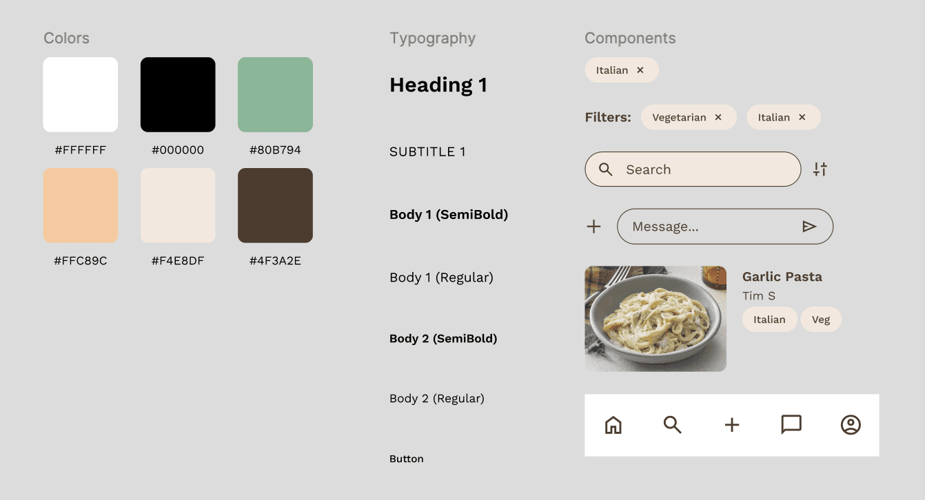
Design system choices
I used a warm, food-inspired design system with:
Neutral and earthy tones to create a cozy, approachable feel
Clear visual hierarchy to guide users through recipes
Card-based layouts for consistency across content
Tag-based systems for filters (dietary, cuisine, time)
Simple, readable typography for step-by-step instructions
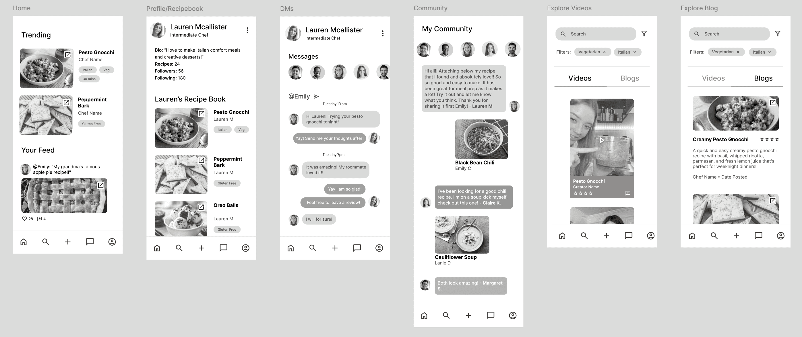
Lo-fi wireframes
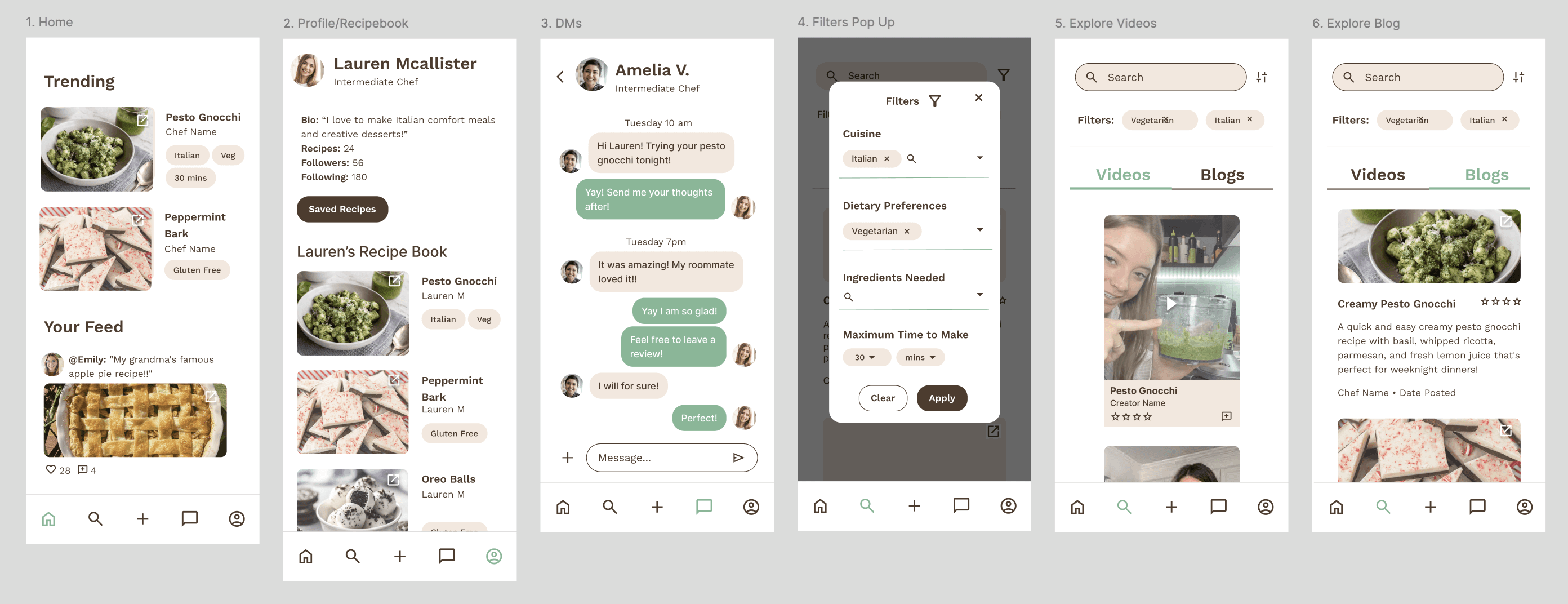
Incorporating Feedback
Simplified filter UI and improved CTA visibility
Strengthened hierarchy in recipe creation flow
Improved readability in comments and recipe pages
Increased consistency across components
The Final Designs
Refined layouts with better spacing, clearer interactions, and a more cohesive system across all screens.

1
A personalized home feed with trending and social content
2
Recipe exploration via videos and blog-style posts
3
Advanced filtering (dietary, cuisine, time, ingredients)
4
A structured recipe creation and sharing flow
5
Saved recipe organization within user profiles
6
Comments, ratings, and direct messaging for interaction
7
A community space for sharing and discovering content
Reflection
Designing this product reinforced how structure and simplicity drive user confidence.
Next Steps
Smarter recommendations
Improved onboarding
Expanded community features
Additional usability testing
Key Learnings
Organization is as important as discovery
Clear structure builds user confidence
Small UI details significantly impact usability
Real-world use demands simplicity